This image reprsents the letter "O." I really enjoyed working with this picture. I found that the possiblites could be endless, just like the shape of the letter O. I cropped out the hands of my friend and put it behind a space background, that i found on the internet, then added an image of the earth that i found of the internet as well. When i was looking at the picture with all the layers in place, the earth looked a little awkward because of the shadowing with the hands. I then just took a soft edge brush and darkened the outlining areas to make it look more realistic.
I am very proud of this picture, i found that photoshop is a very powerful tool and the possibilities are endless with it.
This picture is of a coat hanger in a bathroom. To me it resembled the letter J. I cropped out the hanger and used it as a top layer while i used the gradient tool with a rainbow effect. I thought that the rainbow effect would add a nice contrast to it since the hanger is silver.

This image is of a lock that looks like the letter U when turned upside down. This image was a little harder to decide how edit it. I used the contrast and brightness tool and almost maxed out the contrast. i thought that it made the image look more striking to the eye. I then made a new layer and cropped out a circle in the middle and darkened the area behind it. This made it seem as if a flash light was focused on it.
I really enjoyed how this pictures turned out. I started not having any ideas to creating somthing artistic.

Is picture was of the tile wall in the bathroom with a crack in the sealing. I thought it looked like the letter L. When i shot this image i already new what i wanted to do with it. I thought of a Bob Marley poster my friend has that used red, yellow, green, and black. I thought the colors really flowed yet had a lot of contrast together. I think with this picture i showed exactly how the colors can do just that.

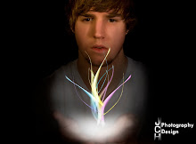
For this image i shot a dresser handle that had a shadow of a C. This was a little hard to edit because the image was pretty blury. I was a little absent minded when doing this picture as well so i just kind of messed around with the gradient tool untill i got something i liked. I then took a soft edge brush and darkened the shadow of the handle to really make it pop.