Tuesday, November 3, 2009
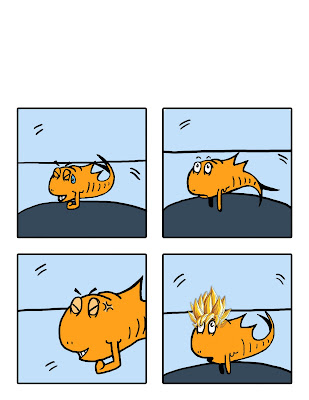
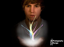
This blew my mind...

some finished products
Thursday, October 22, 2009
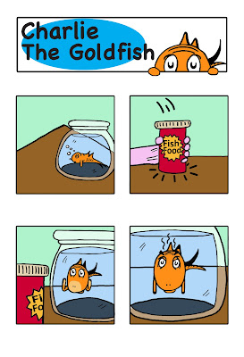
comic #1 so far...
Wednesday, October 14, 2009
Tuesday, October 13, 2009
"Fish" my character
Saturday, October 3, 2009
my comic? what comic?
Over the last couple of days I have just been kind of brainstorming on ideas I want my comic to be about. Like what characters I want, the scenery, and the storyline. On Friday I decided that I wanted to do a comic about the goldfish, and the character I am Sam from Dr. Seuss. I think that they basic storyline will be them living in an apartment together trying to get through normal day challenges.
Recently I have been practicing my drawing on the characters with different facial expressions, gestures, and body language. Once I feel comfortable being able to draw those I’ll move on to the scenery they will be engaging in. I defiantly like to work on a large workspace where I can spread everything out and listen to music. Things that distract me can be just about anything. I can usually stay focused on something for quite a while, but my concentration can be broken easily with a text message or my roommates or facebook. I kind of like to have my concentration broken up though because if I’m too focused on something I can get frustrated pretty fast and then I just want to give up.
I think to be able to complete this comic I need to stay focused on checkpoints like finish these panels by a certain time, and keep the storyline moving so I don’t get bored. I really enjoy what I’m doing in this class so it gives me that extra push to keep trying.
Marvel: The Road to Civil War

Wednesday, September 30, 2009
Something New

Something that I picked up on the other day in class when I was looking through comic books and pictures books is how simple yet effective Dr. Seuss’ illustrations are. I like how his imagination allows him to create all of these wonderful worlds and creatures, but its still tied down to the world we live in. Take for instance the fish from “The Cat in The Hat,” I’ve never seen a fish like that in my life, but to kids that see the book for the first time they don’t see anything wrong with it. It’s a simple illustration that fits the description he is trying to portray.
My Artistic Father


One of my artistic fathers would probably be Vincent Van Gogh. I really enjoy how he takes little brush strokes and creates masterpieces out of them. It almost seems like he does abstract painting but he creates very realistic artwork. I want to focus my artwork in that way, take sometime fairly simple and create something magnificent out of it.
Bonsai sushi resturant... a place new to me

I was never really a fan of Asian cuisine growing up as a kid. It was only a few years ago that I really started to develop a taste for it. I experimented first with Panda Express and found it to be amazing and much more than I expected! I think a lot of it was the fact that it was Asian food, made by Americans. But nonetheless it was Asian and I was ready for new adventures in this style of food.
The other day my roommate was telling me about this sushi bar called Bonsai down the street. He kept saying, “dude you have to come and try it!” Me being the sheltered American I am replied with, “Hell no!” Some how he talked me into going and trying it out. We got there and I was surprised to see how clean and well kept the restaurant was. There was a bar in front of the sushi chef, and booths for families to sit down for a meal. Immediately I looked at my friend with that sad puppy look hoping he would have the heart to say we could go. Instead he just said, “Dinner for two please.”
So we sat down at a booth and the waiter gave us some menus. Right away I looked for the most generic Asian dish they had available. That’s when I saw it, a number one, grilled teriyaki chicken. I was in the clear! But of course knowing my roommate, the sly dog he is, he ordered a plate of California rolls. Obviously I was thinking they were for him, I mean how big could a plate be right?
So I got my teriyaki chicken first and just devoured it as fast as I could trying to get full so we could leave. And just as I was about to take my last bite, the waiter brought over the plate of California rolls. I kind of laughed at the sight of all of the rolls that were on the plate thinking, there is no way he can finish all of that, we’ll be out of here in no time! That’s when he did it; he grabbed his chopsticks, and shoveled about 4 rolls onto my plate. I cant tell you what my expression looked like, but I could guess it was like telling a 7 year old girl she has to go pick up dog poop.
He started eating his rolls like they were candy. One after the other, like a vacuum sucking up dust. When he was completely finished and he looked at my plate with disgust and told me, “come on, just one, I bought those for you.” Damn, he used the guilt trip on me. Now I had to try, there was no way of getting out of it. So I grabbed my chopsticks, situated the roll so that if I moved it just a little it would go flying on the floor and I wouldn’t have to eat it. I started raising it to my mouth; thinking, ok just one and then we can go. I put it in my mouth and placed it on my tongue, and the taste almost startled me, I wasn’t expecting that flavor. Started chewing, feeling all the mixtures of who knows what was inside and swallowed it. Of course my roommate used the usual reply, “see it wasn’t that bad!” And you know, it really wasn’t! I finished all four rolls he put on my plate. I liked so much in fact were going back every Friday night.
Wednesday, March 11, 2009
Art Department Website
Saturday, March 7, 2009
Book Assignment


Wednesday, February 25, 2009
Table of Contents

Sunday, February 15, 2009
Movie Poster

Saturday, January 31, 2009
Collage/Photo Montage

Picturing the "other"

Monday, January 26, 2009
Alphabet Soup
 This image reprsents the letter "O." I really enjoyed working with this picture. I found that the possiblites could be endless, just like the shape of the letter O. I cropped out the hands of my friend and put it behind a space background, that i found on the internet, then added an image of the earth that i found of the internet as well. When i was looking at the picture with all the layers in place, the earth looked a little awkward because of the shadowing with the hands. I then just took a soft edge brush and darkened the outlining areas to make it look more realistic.
 This image is of a lock that looks like the letter U when turned upside down. This image was a little harder to decide how edit it. I used the contrast and brightness tool and almost maxed out the contrast. i thought that it made the image look more striking to the eye. I then made a new layer and cropped out a circle in the middle and darkened the area behind it. This made it seem as if a flash light was focused on it.
  Is picture was of the tile wall in the bathroom with a crack in the sealing. I thought it looked like the letter L. When i shot this image i already new what i wanted to do with it. I thought of a Bob Marley poster my friend has that used red, yellow, green, and black. I thought the colors really flowed yet had a lot of contrast together. I think with this picture i showed exactly how the colors can do just that.
 For this image i shot a dresser handle that had a shadow of a C. This was a little hard to edit because the image was pretty blury. I was a little absent minded when doing this picture as well so i just kind of messed around with the gradient tool untill i got something i liked. I then took a soft edge brush and darkened the shadow of the handle to really make it pop.
Tuesday, January 13, 2009
scratch assignment


